City Launches Brand Messaging

You may be noticing a new “look” here and there for the City of Dripping Springs.
The City has been developing a rebranding plan over the past several months and is rolling it out beginning today. Working with a committee and with feedback from staff, community leaders, the City’s PR agency, Dripping Springs is unveiling a new City logo and tagline.
According to Communications & Marketing Director Lisa Sullivan, Dripping Springs has never really focused on its brand. But with its rapid growth, it is a perfect time to refresh the brand of the City to reflect that growth and message what makes it such a wonderful place to live and work.
“We’re not changing who we are, it’s messaging who we are,” says Sullivan. “In the past, we’ve used our official seal as the face of our brand. But we are more than that. Our brand is not just a city seal—it is our identity, our personality, our voice. It reflects our citizens and our employees. The committee looked at what makes Dripping Springs so great and created the messaging around that. We are a picturesque city that despite our rapid growth, maintains a wonderful sense of a small-town community, with parks, open spaces, beautiful night skies, festivals, and amazing small businesses. The people and businesses in Dripping Springs are welcoming, helpful, open, authentic, and real. The messaging reflects all that.”
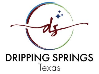
The seal is garnet and gold-colored, featuring a star at the center of a circle. The newly designed logo maintains the City’s current garnet coloring, but introduces dark blue, light blue and green to the City’s color scheme. The initials “DS,” representing Dripping Springs is located within a multi-colored circle, with three small stars at the top right.
Sullivan says the garnet in the new logo represents community, heritage, and schools. The dark blue (and the stars) represents the City’s International Dark Sky Community designation. The light blue is for the “dripping springs” and our history. The green was chosen to represent the City’s picturesque landscapes, parks, and the Texas Hill County.
“A big reason why people move here is because of our wonderful community and school system, which utilizes garnet as their main brand color. But we wanted to reflect all that the City is and all the reasons why people move here. It’s because of our beautiful open spaces, our friendly people, wonderful small businesses and so much more.”
Part of the plan is to showcase the city with beautiful photography. The City is working with Photographers of Dripping Springs, a group of local professional and amateur photographers.
Says Sullivan, “We are so excited to work with this wonderful group of amazing photographers. It’s their wonderful photography that will really showcase all that is great about our community.”
A new tagline has also launched. Sullivan said that we will always be the Gateway to the Hill Country. But in the past, people would drive through Dripping Springs as they traveled to areas west. Now, Dripping Springs is its own destination. The community will start seeing “Open spaces, friendly faces” along with the logo.
Sullivan adds, “We are a City government. We have an amazing Chamber of Commerce and Visitors Bureau. With this new brand refresh, we hope to complement all the great work they are doing.”
The new look and messaging are rolling out July 1st. The City seal will continue to be used on official, legal business for the City, but the community and visitors will start seeing the evolution of the brand and will start seeing the new look today in various items, with the launch of a new website later this summer.
For more information, CLICK HERE to contact the City.
